INTERPRETING LINE GRAPHS
Definition of line graph :
A line graph is a graph that is used to display change over time as a series of data points connected by straight line segments on two axes.
Interpreting the line graph :
There will be two quantities, one quantity will be presented in the x-axis and another quantity will be presented in y-axis.
By understanding the line graph, we have to answer the questions given.
Problem 1 :
Below is a line graph that shows how many books are sold in a charity shop over one week.
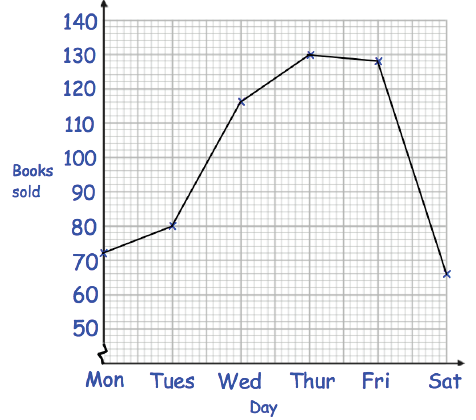
(a) On which day did the charity shop sell the most books ?
(b) On which day did the charity shop sell the least books ?
(c) How many books were sold on Tuesday ?
Solution :
(a) On Thursday the charity shop has sold the most books.
(b) On Saturday the charity shop has sold the least books.
(c) 80 books were has sold on Tuesday.
Problem 2 :
Below is a line graph that shows the population of a village.
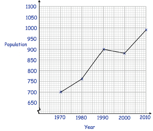
(a) What was the population in 1980 ?
(b) In which year was the population 700 ?
The population is expected to increase by 120 by 2020.
(c) Work out the expected population in 2020.
Solution :
(a)
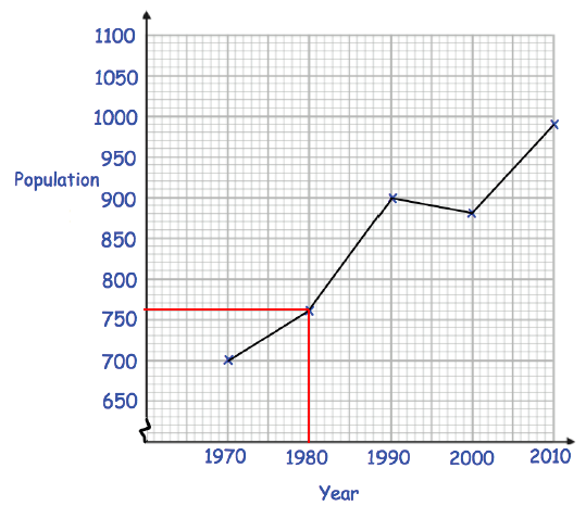
So, the population in 1980 is 760.
(b)
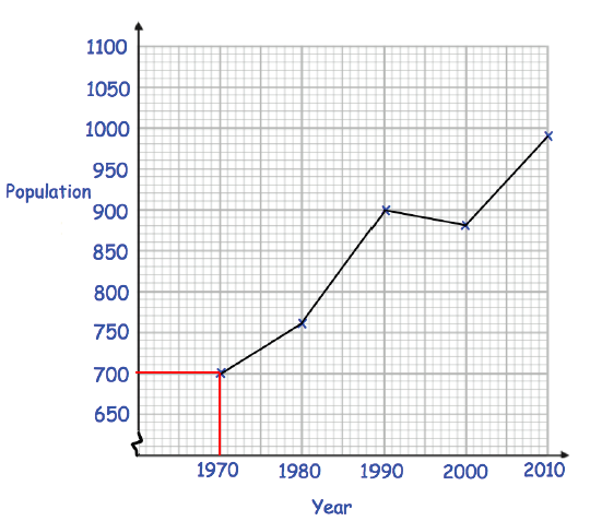
In the year 1970, the population is 700.
The population is expected to increase by 120 by 2020.
(c) 2010 the population in 990.
990 + 120 = 1110
So, the expected population in 2020 is 1110.
Problem 3 :
The table shows the average price of unleaded petrol in England over 5 years.
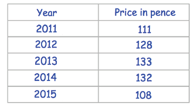
(a) Draw a line graph for the data.
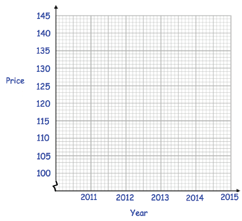
(b) Between which two consecutive years did the price increase the most ?
Solution :
(a)
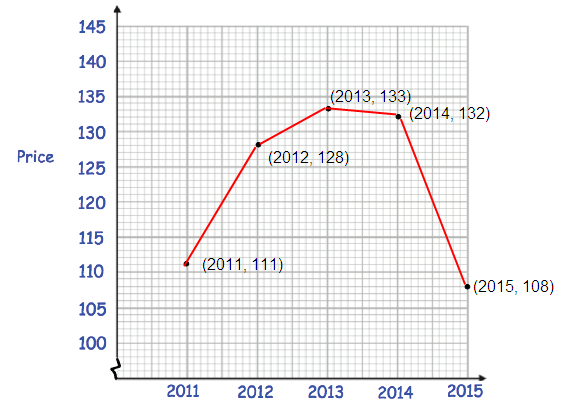
(b) Two consecutive years is 2011 and 2012.
Problem 4 :
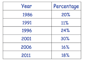
The table shows the percentage of the vote that the Purple Party received in six general elections.
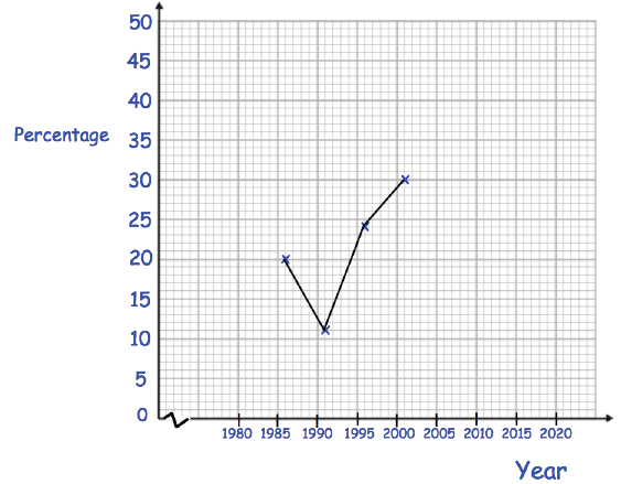
Solution :
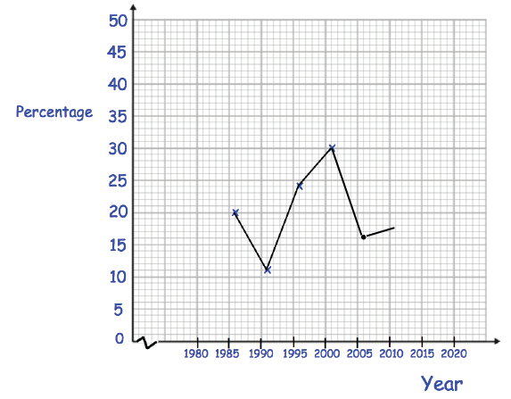
Problem 5 :
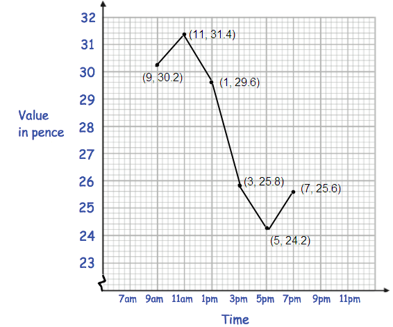
The table shows the value of a share in a mobile phone company over one day.
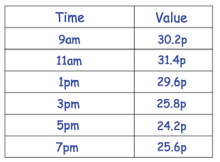
Draw a line graph for the data.
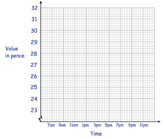
Solution :
Problem 6 :
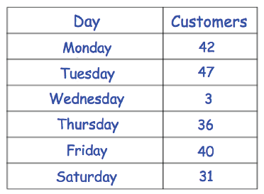
The table shows the number of customers each lunchtime at an ice cream parlour.
(a) Draw a line graph for the data.

(b) On which day did the ice cream parlour have the most customers ?
(c) Work out how many customers visited the ice cream parlour in total.
(d) Give a possible reason why there were only 3 visitors to the ice cream parlour on Wednesday.
Solution :
(a)
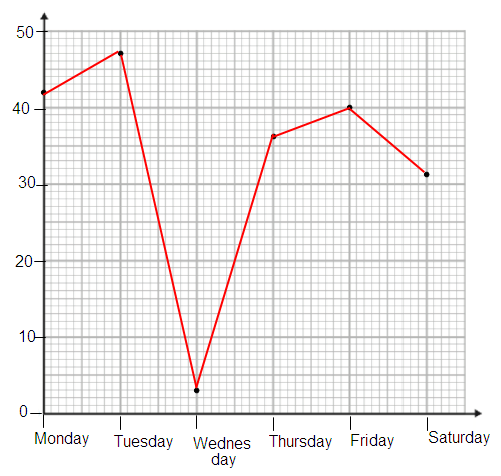
(b) Tuesday in the ice cream parlour have the most customers.
(c) Total customers = 42 + 47 + 3 + 36 + 40 + 31
= 199
Hence, 199 customers visited the ice cream parlour.
(d) Rain /snow = weather related
Power cut etc = early closing of store
Recent Articles
-
Finding Range of Values Inequality Problems
May 21, 24 08:51 PM
Finding Range of Values Inequality Problems -
Solving Two Step Inequality Word Problems
May 21, 24 08:51 AM
Solving Two Step Inequality Word Problems -
Exponential Function Context and Data Modeling
May 20, 24 10:45 PM
Exponential Function Context and Data Modeling