DESCRIBING TRENDS IN SCATTER PLOTS WORKSHEET
Problem 1 :
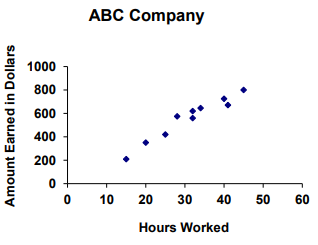
The scatter plot below shows a relationship between hours worked and money earned. Which best describes the relationship between the variables?
A) Strong positive correlation B) Weak positive correlation
C) Strong negative correlation D) Weak negative correlation
Problem 2 :
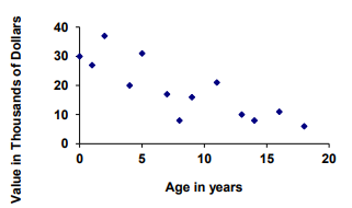
This scatter plot shows the relationship between the age of a car and its value. Which best describes the relationship between the variables?
A) Strong positive correlation B) Weak negative correlation
C) Strong negative correlation D) No correlation
Problem 3 :
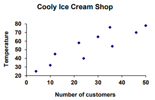
This scatter plot shows a relationship between the outdoor temperature and number of customers in an ice cream store. Which best describes the relationship between the variables?
A) Strong positive correlation B) Weak positive correlation
C) Weak negative correlation D) No correlation
Problem 4 :
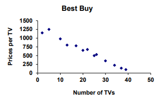
This scatter plot shows a relationship between the TVs purchased and prices. Which best describes the relationship between the variables?
A) Strong positive correlation B) Weak positive correlation
C) Strong negative correlation D) Weak negative correlation
Problem 5 :
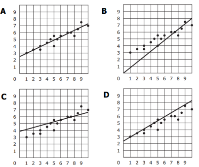
Which graph has a Trend Line that is the best fit for the data? C
Problem 6 :
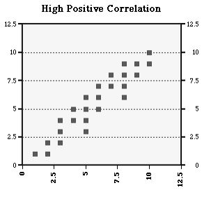
Draw a line of best fit:
Problem 7 :
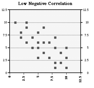
Problem 8 :
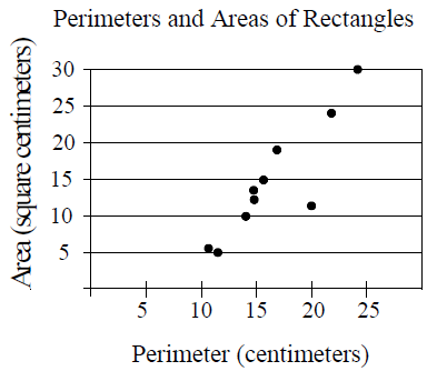
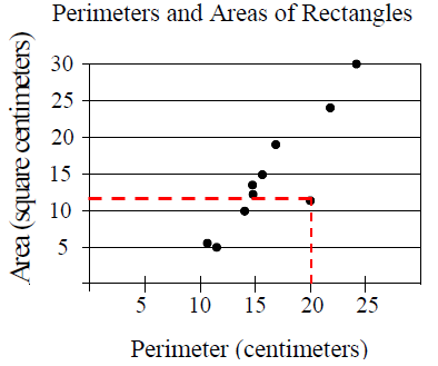
The scatter plot above shows the perimeters and areas of 10 rectangles. What is the perimeter, in centimeters, of the rectangle represented by the data point that is farthest from the line of best fit (not shown)?
Answer Key
1) strong positive correlation.
2) weak negative correlation.
3) weak positive correlation.
4) strong negative correlation.
5) Option A is correct.
6)
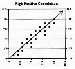
7)
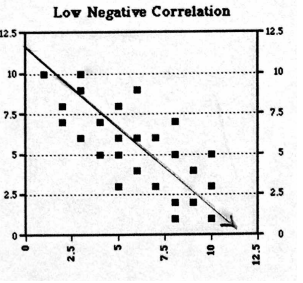
8) So, the required answer is 12.
Recent Articles
-
Finding Range of Values Inequality Problems
May 21, 24 08:51 PM
Finding Range of Values Inequality Problems -
Solving Two Step Inequality Word Problems
May 21, 24 08:51 AM
Solving Two Step Inequality Word Problems -
Exponential Function Context and Data Modeling
May 20, 24 10:45 PM
Exponential Function Context and Data Modeling