DESCRIBING ASSOCIATIONS IN SCATTER PLOTS
Scatter Plots :
A scatter plots is a mathematical diagram represented by a set of dots that displays the relationships between two numerical variables.
Then x-coordinate of the dot, measured along the horizontal axis gives the value of one variable and y-coordinate of the dot, measured along the vertical axis, gives the value of the other variable.
Regression line or the line of best fit :
When the set of dots are plotted, usually there is no single line that passes through all the data points, but we can approximate a linear relationship by finding a line the best fits the data. This line is called the regression line or the best fit line.
Types of Association
- If the slope of a regression line is positive, then the two variables have a positive association.
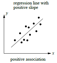
- If the slope of a regression line is negative, then the two variables have a negative association.
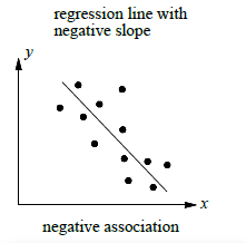
- If the slope of a regression line cannot be determined, then the two variables have no association.
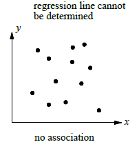
Problem 1 :
The scatter plot above shows the average scores of 10 golfers and their weekly practice times. The line of best fit is also shown.
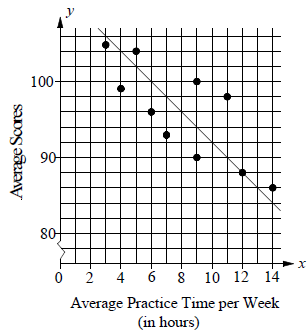
What is the average score of golfer that is farthest from the line of best fit ?
a) 93 b) 96 c) 98 d) 99
Solution :
The average score of the golfer that is farthest from the line of best fit is located at (11, 98).
(11, 98) ==>(Average practice time, average score)
So, the required average score is 98.
Problem 2 :
Using the scatter plot above, answer the following.
There are two golfers whose average practice time is the same. What is the difference between their average scores ?
a) 4 b) 6 c) 8 d) 10
Solution :
By observing the graph above, we have same x-coordinate values for two of the points.
(9, 90) and (9, 100)
Difference between average score
= difference between y-coordinates
= 100 - 90
= 10
Problem 3 :
According to the line of best fit in the scatter plot above. Which of the following best approximate the year in which the number of cars repaired by Jay's Motor was estimated be 4500 ?
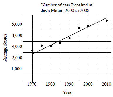
a) 1996 b) 1998 c) 2000 d) 2002
Solution :
According to the graph given, one of the closest point for the given condition lies in between 4500 to 5000
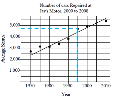
Accordingly option given 1996 will be the best prediction.
Problem 4 :
The scatter plot below shows the average traffic volume and average vehicle speed on a certain freeway for 50 days in 1999.
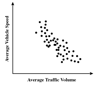
Which statement best describes the relationship between average traffic volume and average vehicle speed shown on the scatter plot ?
a) As traffic volume increases, vehicle speed increases.
b) As traffic volume increases, vehicle speed decreases.
c) As traffic volume increases, vehicle speed increases at first, then decrease.
d) As traffic volume increases, vehicle speed decreases at first, then increases.
Solution :
x-coordinate ==> Average traffic volume
y-coordinate ==> Average vehicle speed
Observing the spread from left to right, it is falling line. Average traffic volume increases, vehicle speed decreases.
So, option b is correct.
Problem 5 :
Ms. Ochoa recorded the age and shoe size of each student in her physical education class. The graph below shows her data.
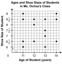
Which of the following statements about the graph is true ?
a) The graph shows positive association.
b) The graph shows negative association.
c) The graph shows a constant association.
d) The graph shows no association.
Solution :
We cannot draw the line of best fit, so the graph shows no association.
Problem 6 :
Which graph best shows a positive correlation between the number of hours studied and the test scores ?
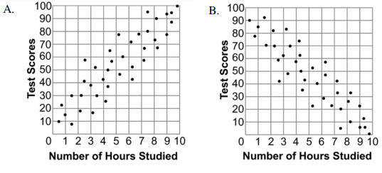
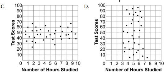
Solution :
Drawing a line of best fit for the scatter plot,
|
option a : Raising line option c : Horizontal line |
option b : Falling line option d : Vertical line |
So, option a is correct.
Problem 7 :
Use the scatter plot below to answer the following question.
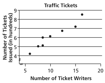
The police department tracked the number of ticket writers and the number of tickets issued for the past 8 weeks. The scatter plot shows the results. Based on the scatter plot, which statement is true ?
a) More ticket writers results in fewer tickets issued.
b) There were 50 tickets issued every week.
c) When there are 10 ticket writers, there will be 800 tickets issued.
d) More ticket writers result in more tickets issued.
Solution :
x-coordinate ==> Number of ticket writers
y-coordinate ==> Number of tickets issued
Line of best fit can be drawn is raising line. So, number of ticket writers increases, number of tickets issued will also increase.
So, option d is correct.
Recent Articles
-
Finding Range of Values Inequality Problems
May 21, 24 08:51 PM
Finding Range of Values Inequality Problems -
Solving Two Step Inequality Word Problems
May 21, 24 08:51 AM
Solving Two Step Inequality Word Problems -
Exponential Function Context and Data Modeling
May 20, 24 10:45 PM
Exponential Function Context and Data Modeling